Arnotts Furniture eCommerce
A comprehensive overhaul of the shoppable furniture ecommerce pages on Arnotts.ie.
The first large pilot project the newly formed product team tackled together. Lessons learned and updates delivered here would go on to be used elsewhere on the site.
Role
UX/UI Designer
Brief
Improve the Furniture Shopping Experience on Arnotts.ie
Background
The who's and the what's
Arnotts is a high-end department store that has been a fixture of central Dublin since 1843. I was the sole UX/UI Designer on the newly formed Product Team charged with the responsibility of improving the user experience of the site.
One of the first large initiatives I worked on was a redesign of the Furniture section, specifically the Product Display Pages or "PDPs".
Furniture eh?
As a department store Arnotts sells a wide range of products and the furniture division is one of the higher value segments of the business but unfortunately, the ecommerce element of it had been long-neglected.
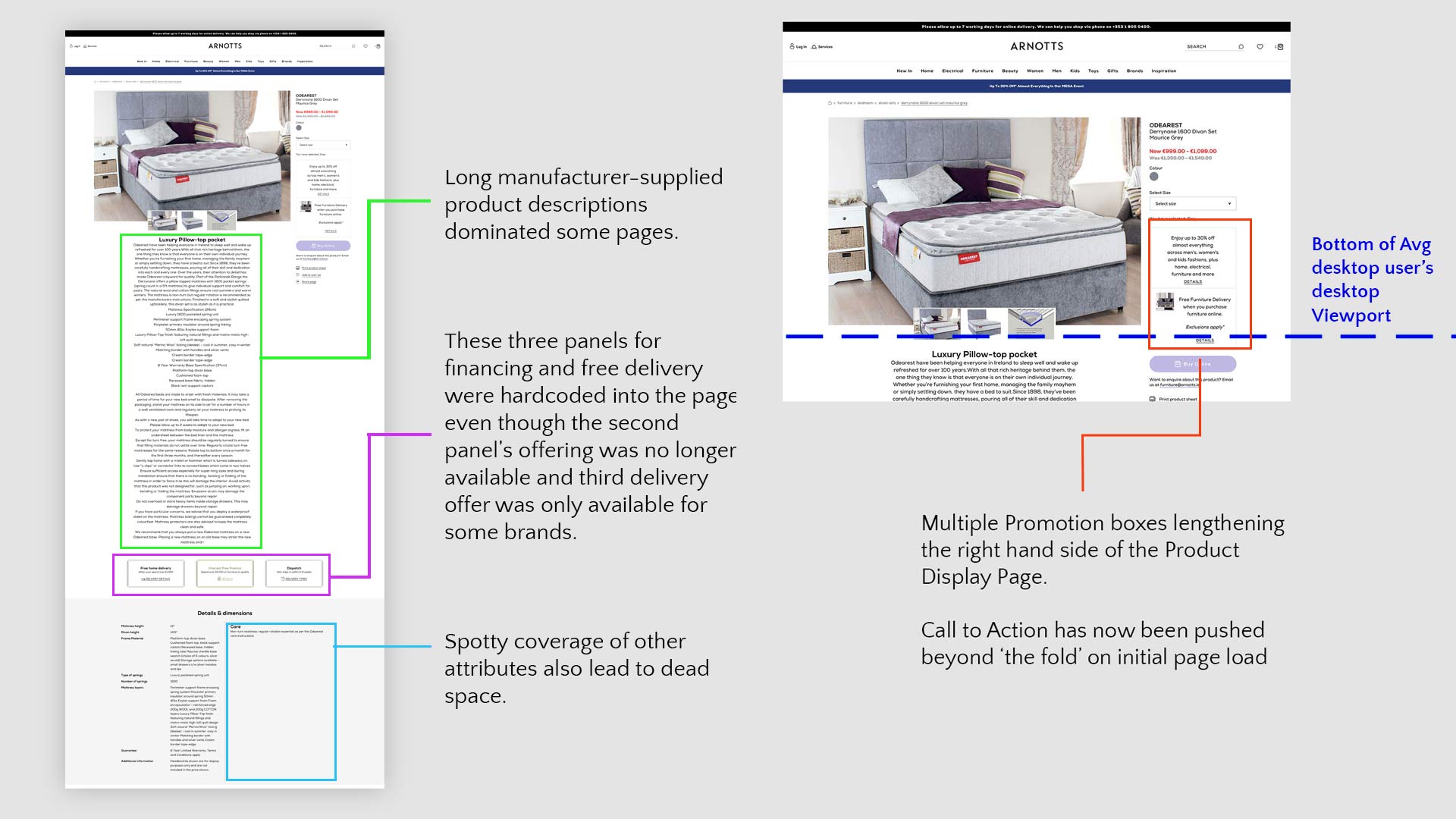
The current iteration of the furniture Product Detail Pages (PDPs) was sadly a hodgepodge of half-hearted initiatives, muddled intentions and technical debt with undocumented and half-forgotten post-runtime script injections heavily modifying the layout and functionality.
In addition to some broken functionality and unsustainable maintenance procedures, this implementation leads to an unsightly 'flash' on page load of the regular layout before the script has time to kick in.
But an upcoming reorganisation of our back-end Salesforce Commerce Cloud technology provided an ideal opportunity to revisit the furniture section and show it the love it deserved.
Just some of the issues with the original Furniture PDP layout
So where's the Beef Brief?
This project came from business stakeholders who had long complained about the furniture PDPs and so the first step in our proposed redesign was a series of meetings with those same stakeholders to gather both background information on the furniture section, their hopes and aims that they feel were not being satisfied and finally to learn of any potential traps or technical limitations that led to the current structure.
This initial stakeholder engagement was very well-received and while I stressed to them that this was merely an investigation exercise and that not all their issues would be tackled, having them being heard by the Product Team certainly helped to generate buy-in down the line.
It became clear from these sessions that there was a lot of meat on this particular bone, and there were 3 tasks before us.
1.
User led (Re)Design
Department managers had a lot of thoughts about what the page needed or didn't need but I noticed that I rarely heard these being framed in terms of our audience's needs. This wasn't specific to the furniture section, but more of a culture within the company that I thought this project could be the first step in turning things around.
2.
Feature Consolidation & Tech Debt
As mentioned, there was a lot of bloat on these pages; The layout was being altered by a js snippet injected via Google Tag Manager, incorrect image sizes were being delivered to the page, some sitemap irregularities meant some furniture products were not classed as 'furniture' so were not being displayed consistently, there were custom template changes made at the architectural level for… reasons and more.
3.
New Functionality
Stakeholders clearly had a range of new functionality and features they were eager to push. Which is great! Passionate, engaged stakeholders are a dream for me, but I needed to balance delivering what they wanted and keeping their feet on the ground. There was only so much we were going to be able to deliver in one sprint.
Our Target Audience
The who's and the what's
Thankfully we already had a whole host of salient data on our customers, so it wasn't too difficult to cobble together an idea of who our users were - with the caveat that we would maybe have to twist it a little to apply it to the furniture section.
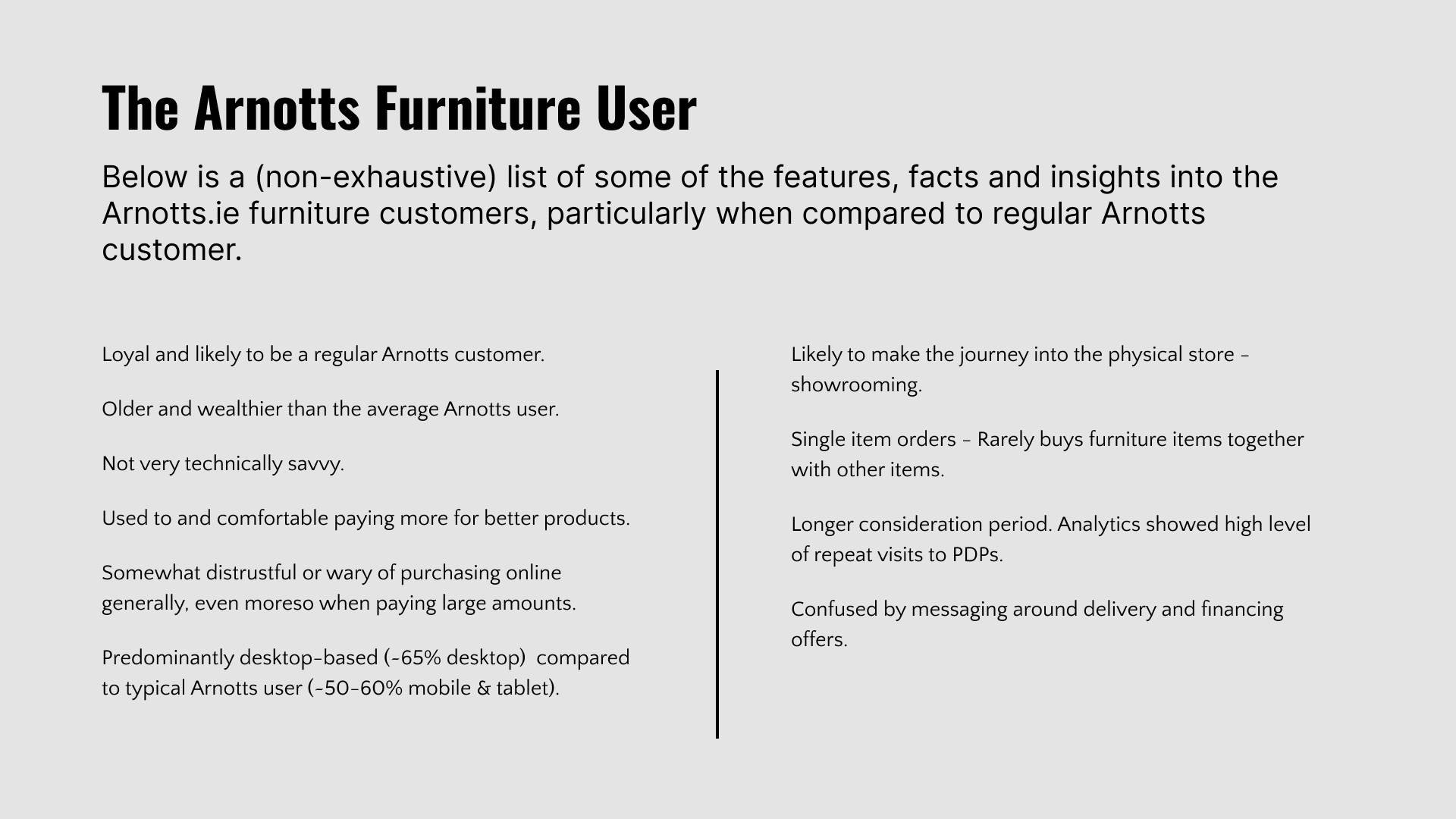
Your 'typical Arnotts customer tends to skew a little older, a little wealthier and a little less technically savvy, per se, than the average Irish consumer. And when it comes to furniture, our users were even a little older and wealthier than the garden-variety Arnotts customer and crucially for us, they were even more distrusting of paying money online.
Some general insights into the qualities, concerns and pain points of the target audience.
The online furniture purchasing journey for this segment is also a very different prospect than buying a shirt or a coat. People are naturally warier of spending £3,000 on a 3sqm couch than spending 50 on a shirt they can easily sell or throw away if they don't like it. The online sales volume for furniture in Arnotts was very low but we were still able to determine that the average order value that did contain a piece of furniture was between three to five times larger than the average clothing or beauty item order.
Coupled with our users' lack of technical acumen, this high price, high uncertainty environment fosters a very low-trust relationship between Arnotts and it's users; They're wary of spending all this money when they don't know the size, weight or sometimes even the colour of what they're buying. Cornflower Blue can look very different on a suede couch versus on a side table. Which, again, can be a big deal when you're talking about spending several thousand euros.
In addition, from engaging with our in-store colleagues it became clear that, as with many other items, many shoppers browse online first for items they may like and then convert their purchase in-store after being able to see them in person. became apparent that this was much more commonplace for furniture shoppers.
Common complaints that came back from the customers via our in-store colleagues were an inability to judge the size of the furniture, difficulty gauging what the colour would actually look like, limited data on fabric and materials used etc.
From our discovery sessions with stakeholders, we had a number of features they were pushing hard to include, but we didn't have a lot of input from the users yet. So, together with our crm team I formulated a short survey to ask users that have visited the furniture section to rank features or information in terms of importance to them. This helped me to validate the points raised by internal stakeholders and reorganise our development goals. Some of our internal priorities did not match up with our user's expectations but rather were articles of faith discussed internally and incorrectly thought of as 'killer' features. That's not to say that the desired changes weren't valuable, just that their utility to our user base was likely overstated.
The Challenge at Hand
Armed with our survey data we went back to our primary stakeholders and slimmed down the requirements and requested features. Our team projected a rough timeline of when we might be able to deliver on them as the back-end re-platforming happening in the background may have made organisational sense for us to sort out the front-end too, the knock-on consequence was that already scarce development resources, became even scarcer.
A comprehensive PDP redesign for the whole Arnotts site was also on our roadmap for the coming year so in the interest of development efficiency, I looked for where we could find commonalities between the future PDP project and the current Furniture project. Common features or improvements were given a degree of priority over the more niche ones. (Sorry, 3D Augmented Reality Furniture projection system… maybe next year?…).
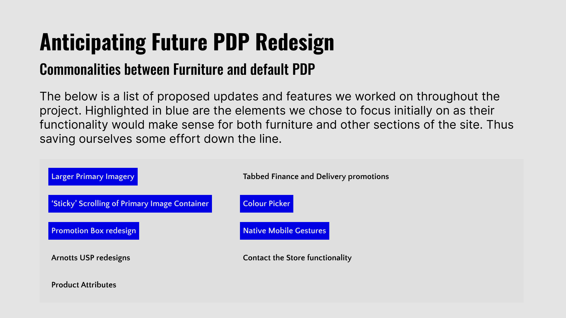
We derived the scope of this project from a combination of stakeholder input, user research, a pragmatic approach to feasibility and decided on these key priorities
Design, Present, Prototype, Repeat
We now were on much firmer ground with a clearer vision of what we were working towards. This didn't happen by accident of course but was the result of concerted efforts to clarify requirements and manage stakeholders while also being pragmatic about what is realistic to deliver in a handful of sprints. All this is part of the design process of course, but it was only now that we were at the point where I could start 'designing' because we had achieved a few things;
Built Trust
Stakeholders had been involved in our process at almost every step of the way. Clear lines of communication and transparency had built trust allowing us, the product team to advise and provide input that was better listened to than it might have been at the outset
Defined The Problem
We had a clearer idea of what the central brief, 'Make it better' meant. We now had something to hang our hats on. A marker to aim for and clear areas where we felt we could substantially improve the user experience.
Knew what 'good' looked like
Through the series of sessions, we had with stakeholders a multitude of competitors were mentioned as well as several other points of reference that would serve as inspiration for us. Like most UX projects this was a mix of solving problems, removing points of friction and executing on a brand's vision of itself to elevate the user's experience. Not all of these comparisons could be drawn from directly, but it helped to cement a shorthand between the product team and our client, the managers.
Established a process
The product team also set a regular cadence of check-in meetings with our primary point of contact to clarify outstanding questions and also sense-check to ensure we're still on track to deliver on their desires. Setting regular check-ins might seem like the simplest step, but looking back it was crucial to deliver on this project and had we not done that and operated in a silo, I think it would've been too easy for aims to diverge. The regular rhythm allowed us, the development team and the business, to hold each other accountable.
DESIGNING SOLUTIONS
With all of these resource limitations, stakeholder preferences, audience data and knowledge of best-practices to hand I set out by taking a proverbial large red pen to the current PDP.
Primary Imagery
Taking into account user concerns, clearly larger imagery would need to be implemented natively onto furniture PDPs. Thankfully, our image server already provided the option for sufficiently large imagery. , I implemented a larger container for a 1080px wide image as standard on any viewport larger than 1600px.
I also implemented a subtle thumbnail indicator or counter beneath the primary image to give the user context as to how many pictures they can slide through. A very small change relatively speaking, but an important one I feel that demonstrated respect for the user's time rather than letting them unknowingly loop back through already-seen images.
Some new 'sticky-scroll' behaviour was also applied to the primary image container. We had already uncovered an insight that large high-quality imagery was high on our customer's list of needs and also uncovered a problem with the right-hand side of our PDPs. Namely, the content was making that side very long and a host of white space was being created beneath the image.
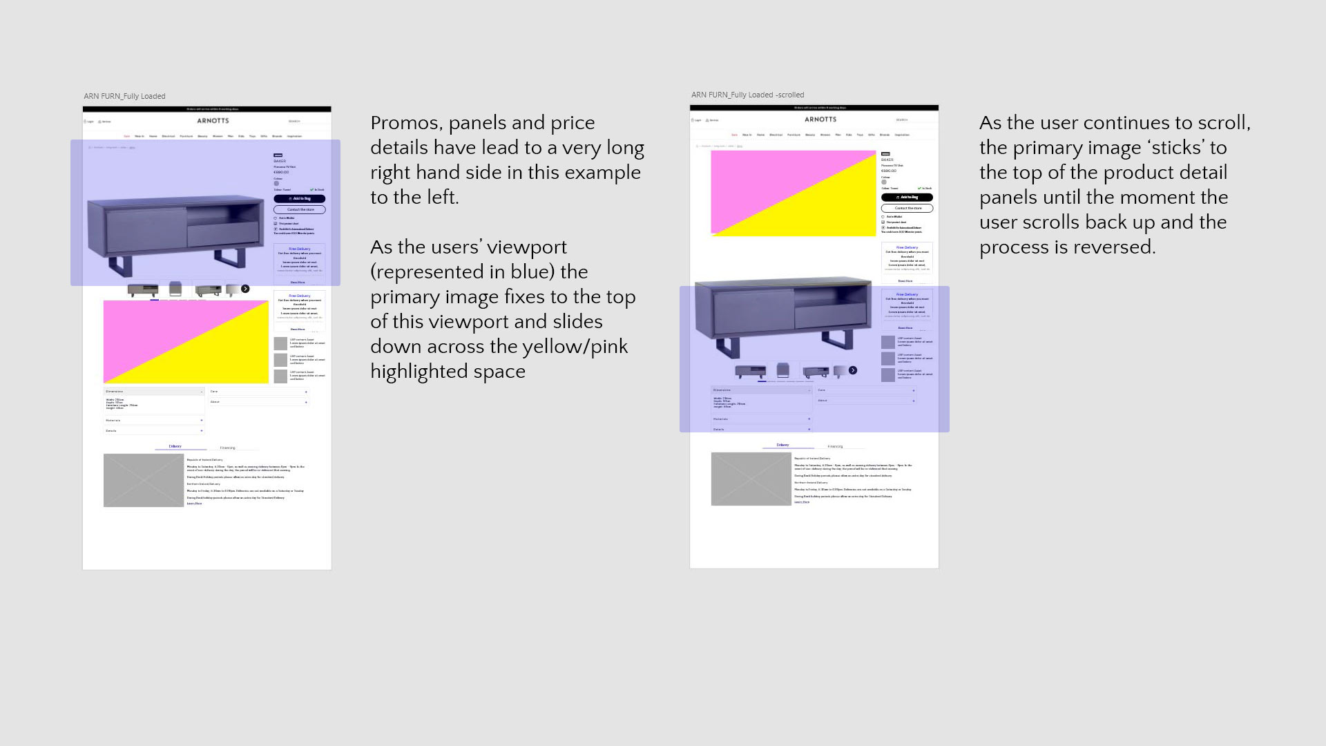
Primary image sticky scroll
It was for this reason that we also implemented a behaviour where the main image gallery would stick to the top of the user's viewport as they scroll down the page until the product attributes beneath came into view where the image would revert to normal behaviour.
This might appear to be a remedial and simple change but stakeholders were initially resistant to have images moving or sticking and un-sticking so I put together a (rough) working prototype webpage to engender the buy-in we needed.
See Scroll Behaviour PrototypeProduct Attributes
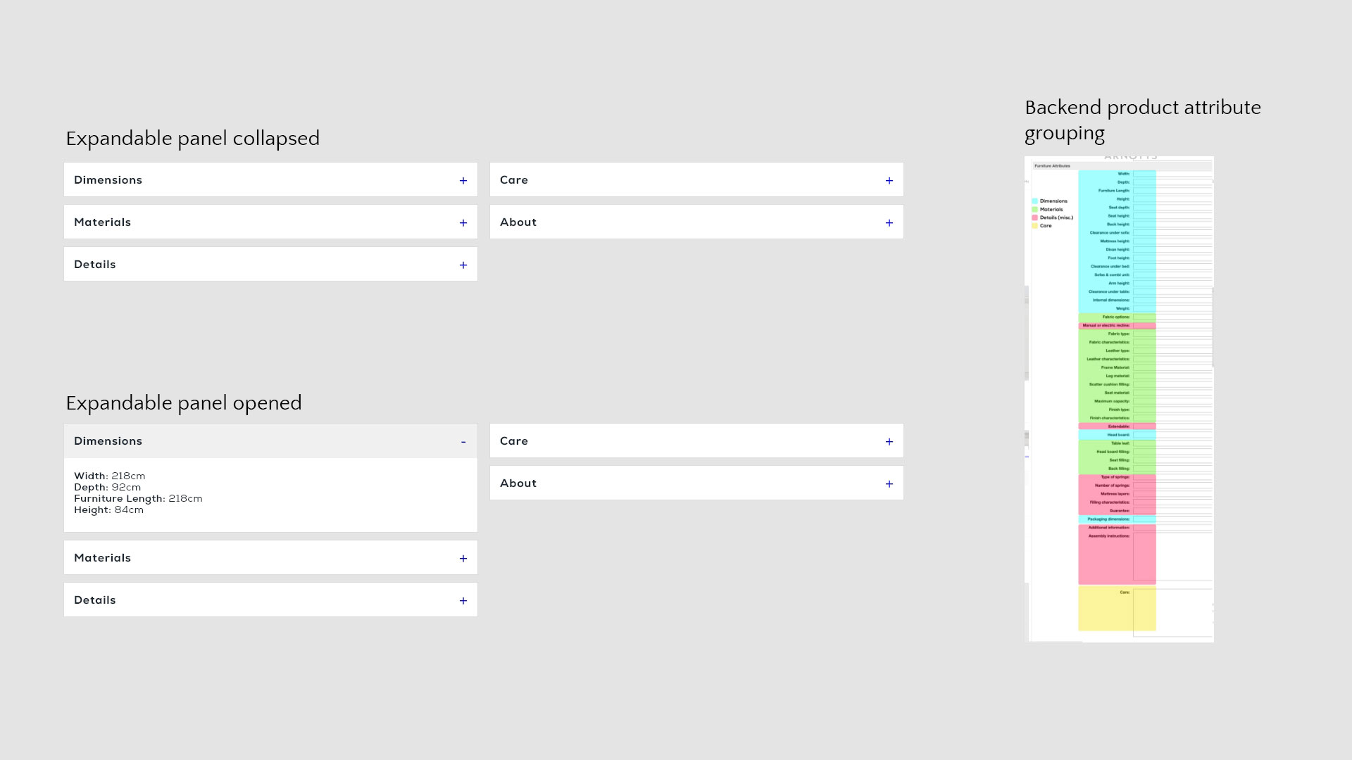
Products on any ecommerce platform of course come with a range of metadata, size, colour, price, material, manufacturer's blurb etc. And on a product catalogue as diverse as Arnotts that can lead to a lot of irrelevant, to the customer, metadata making it through to the front-end. Or even if the data is relevant to a customer it comes at them in a huge data dump and paralyses the user and the most relevant information just becomes noise. Furniture was an especially dense segment, in terms of product metadata or attributes. There is also uneven coverage as some products have a full set of attributes and others very little.
So I grouped related attributes together and bucketed them together and ranked them in order of relevance. This allowed PDPs to 'gracefully degrade' so if a certain product didn't have colour data, or material care instructions attached instead of leaving awkward blank spaces on the page, the respective expandable panel would simply not appear on the page.
Expandable Panels
The furniture component of the Arnotts catalogue comes with a number of financing options depending on the brand involved, time of year etc. Low or zero percent financing is another lever we can exercise to engender trust in a user and lessen the anxiety around paying so much money. However, the existing implementation was rigid and at times irrelevant as there was no mechanism to display correct information on the correct products. Instead, we were introducing a point of friction as users will click on something offering interest-free finance, only to find out the offer wasn't applicable to their chosen product.
As such, we re-formatted the bottom panels on the backend to be tied to specific products and also reconfigured on the front-end for these panels to be firstly displayed in full width as tabs and also for this content to be editable by the content teams. This afforded a degree of flexibility to change the copy, imagery or layout if a delivery or finance offer changes or for seasonal promotions.
Product Attributes on both the front and back-end.
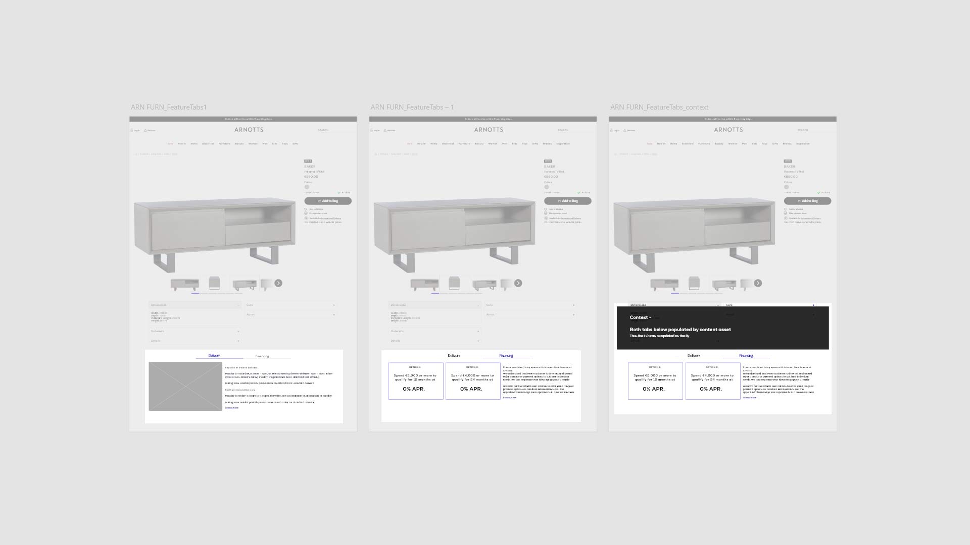
Delivery and Finance Tabs.
Promotion functionality
Promotions were flagged early on by stakeholders as key drivers for our audience but the current implementation was quite poor and often broken with hard-coded links directing users to error pages and broken images. These 'promo panels' as they are called were used on a variety of pages across arnotts.ie
In consultation with these stakeholders I gathered their requirements for the promotion panels to set about improving their functionality.

The original promotion panel
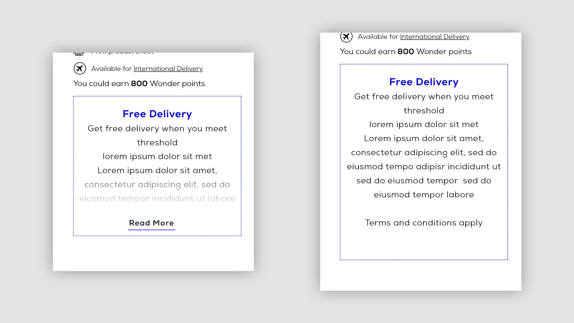
The updated design for promotion panels
In the new version, the image has been stripped out entirely. The placement is a very small space and in context, an image was not adding much. Any imagery can be placed onto a separate promo page that might perhaps provide more detail to any promotion.
A configurable blue dotted border was added to the panel to a) differentiate it from other elements on the pdp and b) allow some promotion-specific branding to be applied. If for example a Christmas promotion is being run, this border can be a festive red. This same colour can also be applied to the header text inside the promotion also.
A height limit has been imposed on the panel to prevent the right-hand side of the PDP from becoming too long. Once the character limit is exceeded, the text is truncated and hidden behind a 'click to read more' link. This allows any interested users to still view more promotion detail on the page. This was a direct response to stakeholder feedback that promotions often had specific terms and conditions that needed to be communicated to the audience.
The CTA was also made optional. If the CTA is included in a promo the maximum height limit was extended slightly to accommodate.
The promotion functionality was one of the key components that affected all PDPs site-wide across Arnotts.ie, it was crucial that it be robust, but flexible enough to satisfy a broad range of stakeholder wishes and yet not impact the viability of the PDP pages themselves. You may view a prototype of the promo behaviour below.
See Promotion PrototypePresenting
With the wide range of changes being implemented a regular sequence of meetings between the Product Team and stakeholders was called for to ensure all the relevant parties are kept up to speed and the updates being developed are on-track with the requirements.
So one of the measures I took together with our Product Manager, was to develop a constantly updating feature 'one sheet' to walk stakeholders through the updates, whether they're technically minded or not. This also provided us with a document that we could point to when other departments or more senior managers came to ask questions, or our immediate point of contact - the furniture brand manager - was able to take the sheet to present it herself.
See One Sheet ExampleDelayed & Deprecated Features
In the course of this project a number of other features were discussed and developed to varying degrees that didn't quite come to fruition. A range of factors including limited development resources, hard technical barriers or even simply time all played their part here.
Full-size Colour Swatch
As was established in our early research phase, being able to determine what your new furniture will look like is a hugely important aspect for our users.
Colour is, naturally, a huge part of how your furniture looks especially when you consider the type of material. Lime green can look very different in cotton or velour than in say leather for example.
The current swatch on Arnotts only showed a small 64px by 64px tab and a basic colour name provided by the manufacturer, which was usually quite basic in name; 'brown', 'black', 'blue' etc. Of course there's potentially a world of difference between two 'blues' alongside the texture issue so we set about trying to solve this pain point for our users.
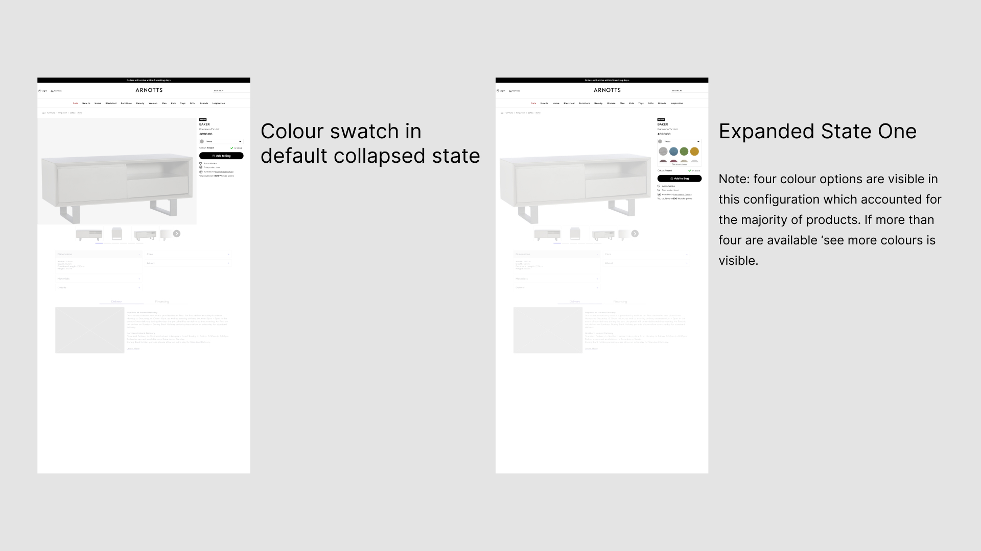
Colour Picker - Initial state and first expanded state
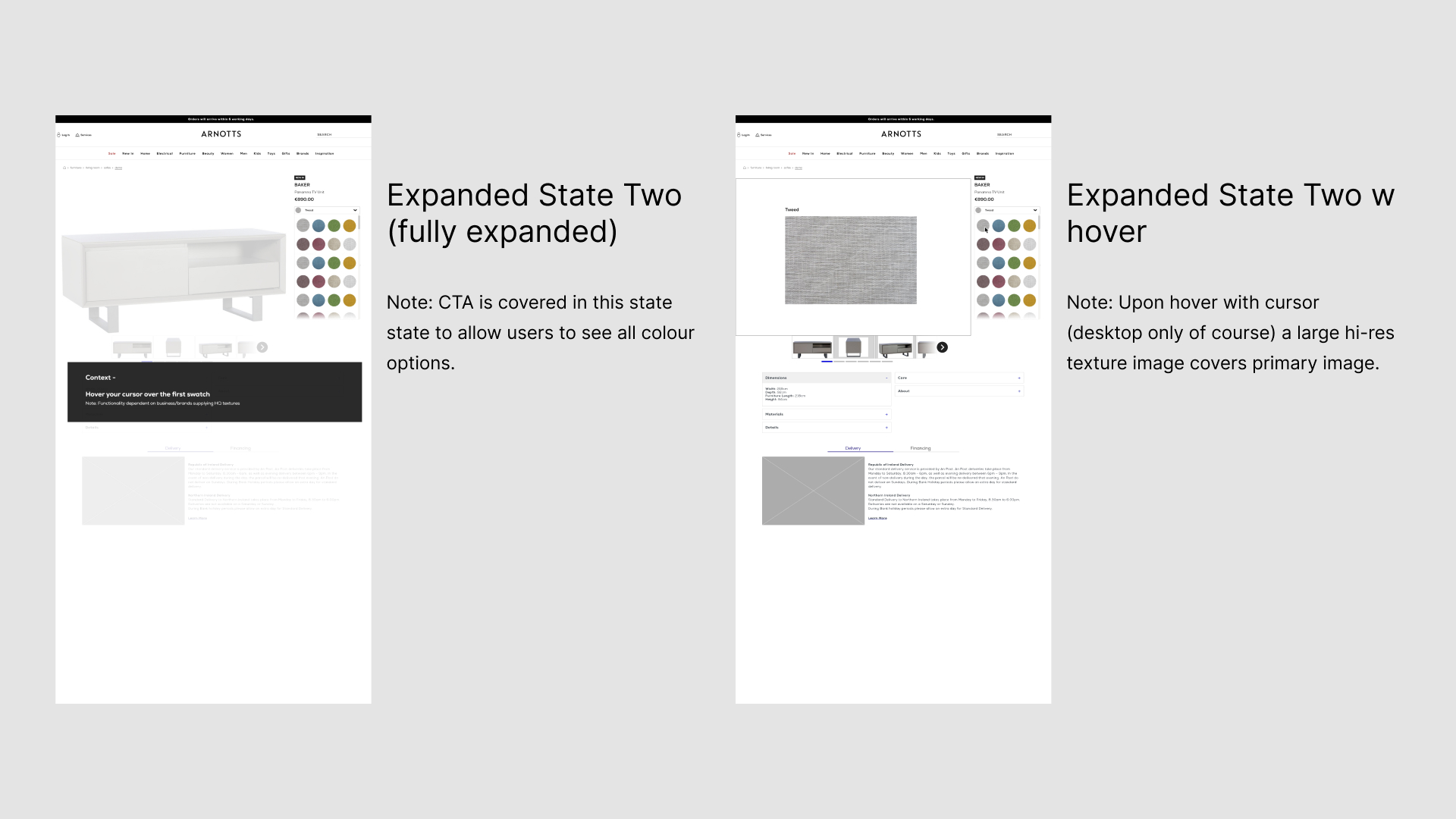
Colour Picker - fully expanded and hover behaviour
The thinking was pretty straightforward, basically reformatting the colour swatch to meet our users half-way. So that firstly meant larger colour thumbnails on the colour picker itself. Next we took into account that typically our furniture catalogue had a very limited set of colour options compared to some of our other items (cosmetics for instance tend to have a large number of colour options). It was very rare that furniture would have an item that had more than four colour options. Therefore, I redesigned to colour picker to account for larger but fewer thumbnails. In addition, I had noted that expanding the colour picker often covered the cta on the PDP, it might seem a relatively minor point but I saw no reason for us to cover the cta and so I added another 'semi-expanded' state to the colour picker. This would only ever be active in those rare cases where there were a large number of colour options.
Finally the largest design change I made was a desktop only hover effect where hovering over a colour thumbnail gave the user a larger close-up preview of the colour and fabric in place of the primary product shot.
You'll recall that our research indicated this 'what is the real colour' anxiety was one of the larger barriers for our users to overcome in order for them to convert so we sought to give them as much information as we could.
Why the delay?
Stakeholders were very pleased with the colour swatch prototype presented to them but this feature ended up being set aside if not abandoned entirely.
The biggest challenge with this element was actually the content. The variety and quality of image assets and colour data from manufacturers was very inconsistent and often very limited. It was proving a challenge to source high quality fabric and material swatches for items in the catalogue and using generic imagery would've defeated the purpose of trying to show the user what their item will actually look like.
Another issue that I raised myself was I doubted the worth of the semi-expanded state and whether it made any meaningful difference to users or it was just some adding needless complexity.
The logic was relatively sound; keeping the cta visible as much as possible and company stakeholders were very positive about the change. I did run small scale user tests of course but generally positive feedback on such a granular change was challenging to discern a real insight. I proposed for us to run an AB test on the site but this was rebuffed due to the development effort it would've required.
In the end the colour picker made it as far as a ticket on our JIRA board but was moved to the backlog as those concerns began to be raised around it's feasibility/value. I did envision revisiting the subject and seeing the picker being in use on other product categories in the future but it remained in the backlog at the time of my leaving the company.
Contact the Store Form
We had established that the Furniture audience and their journey was slightly different from the standard journey. Namely, they're much much more likely to visit Arnotts' physical location to see the furniture in person. The standard PDP already had a contact the store button, but this just sent users to a generic contact page, thus diverting users away from a path of product purchase and conversion.
As mentioned buying furniture online is a somewhat unique proposition. The price per piece of furniture is very high and users might be very wary of committing to a €2/3/4,000 purchase on a webpage. This provided us with an opportunity to leverage our physical location. The Arnotts department store is a fixture in central Dublin and elicits a high degree of trust in it's customer base. So in going against the company's orthodoxy that online conversion is preferable to pushing users to the store, I added an extra contact the store option just underneath the standard 'Add to Bag' button providing options to call the store during business hours or drop an email through a contact form and display the contact form alone when the store is closed where a customer can ask any questions they have, confirm stock levels etc.
The key thing in my mind was to more tightly close the loop between the store and online and give users what they clearly wanted; a conduit to the physical store location. I had been recently working closely with our CRM team as they were re-platforming to Salesforce Marketing Cloud so I knew there was functionality there that could be exploited.
The idea was to provide users with a 24 hour means of communication with the store based on business hours. So when trying to contact the store during the day when it is open they would be provided with an option to call direct to the furniture department or send an email via our new CRM. Then if calling from outside business hours, they could arrange for a callback at a specified time or send an email via the same form.
A wireframe of the above behaviour was presented to stakeholders and was largely well-received and regarded as just the sort of inter-departmental initiatives Arnotts should be taking on.
Why the delay?
Unfortunately, as I worked on the feature several issues became readily apparent.
Firstly the CRM re-platform was not quite on schedule so there wasn't really scope to add new functionality on top of the workload of replicating existing capabilities in the new system, which is what ultimately killed the feature.
Secondly there were practical issues on the store side too. The phone in the furniture area couldn't always be manned which would create a negative customer experience to be left on an unanswered phone. In addition the in-store furniture staff had never arranged callbacks or customer consultations before and there was no existing resource dedicated to providing that service on that side of the business.
And finally we heard that another department in the company was experimenting with chat functionality and the ability to connect with in-store staff via a couple of third party vendors. Obviously if these trials proved to be successful it would make sense to utilise them as part of the comms mix for furniture too but it of course didn't make sense for two teams to be working in silos like this.
Ultimately, due to these factors the contact the store functionality was also parked for another time because the more we worked on it more teams, more issues and more competing priorities cropped up and it became clear that the timing just wasn't right so we decided to park this feature. But a store contact capability was flagged as a key priority that we would revisit in the future.
ABOUT ME
I'm born and raised in Ireland where I worked for over twelve years in a number of design positions for both small teams and larger corporate entities and am looking for my next exciting opportunity in Berlin.
If you like the look of some of the above work, and would like to know more about these projects and the many, many others I've worked on over the years, drop me a line!
Contact
daryloleary@me.com