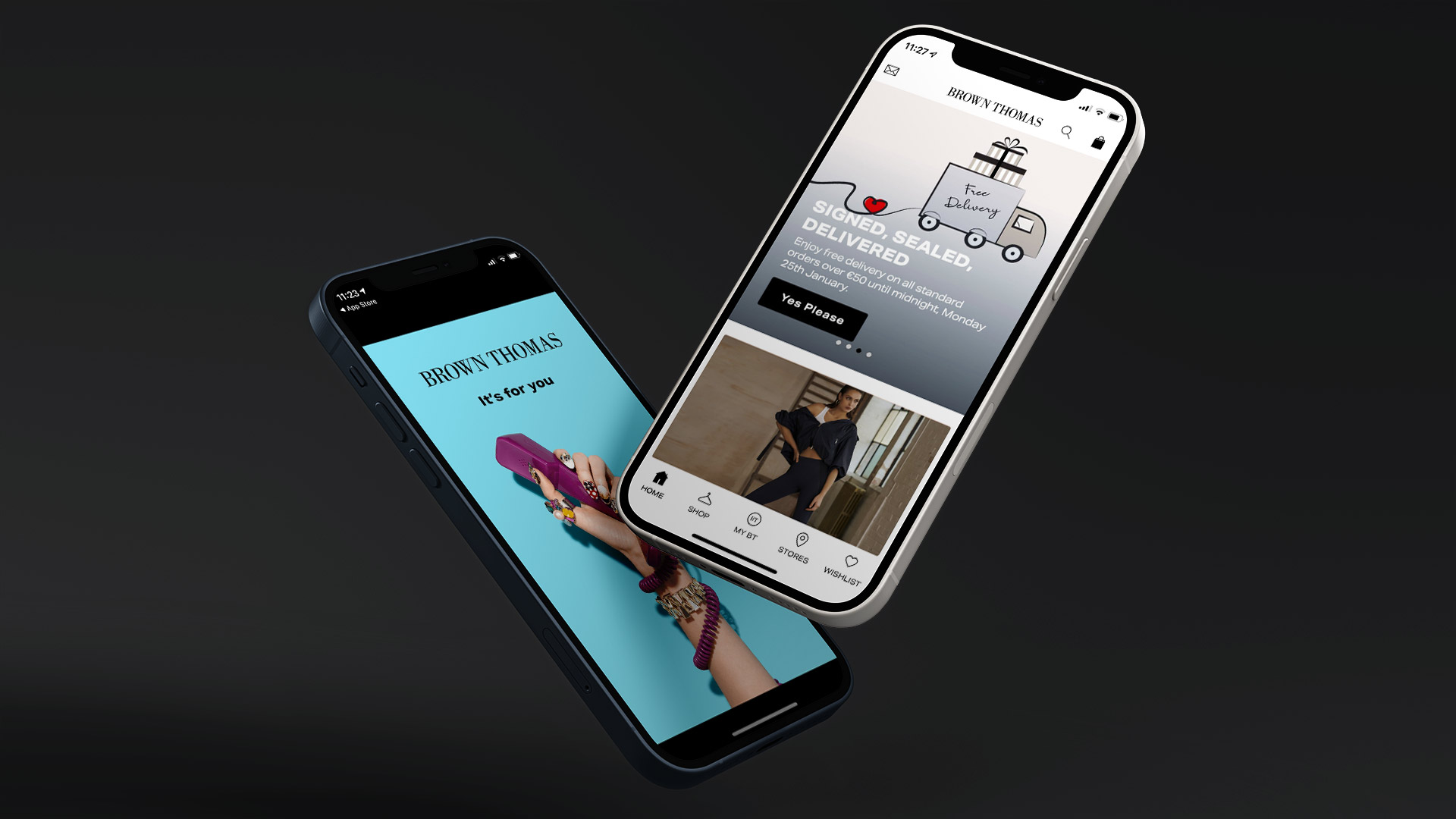
Brown Thomas App Onboarding
A large marketing push for more downloads of Brown Thomas' (or BT for short) app fails to translate into more usage of the app.
I surmised that a cumbersome and demanding onboarding process was creating a hostile environment for new users
Role
UX/UI Designer
Brief
Investigate and design an alternative onboarding experience
Background
Marketing Efforts
In mid-2020 I was involved with a campaign by the Marketing Dept. to drive downloads of the Brown Thomas mobile app. My role was primarily to provide imagery and assets from the app that could be used in various ad formats for the campaign. At this point I had actually done very little work on our app as the platform was run by a third-party supplier, our team's purview was the web experience and Brown Thomas as a company was mostly concerned with maintaining accurate and reliable inventory feeds into the app to ensure stock levels and purchases were flowing back and forth. Additionally, some of the branding and imagery on the home screen of the app was periodically changed to support sales events.
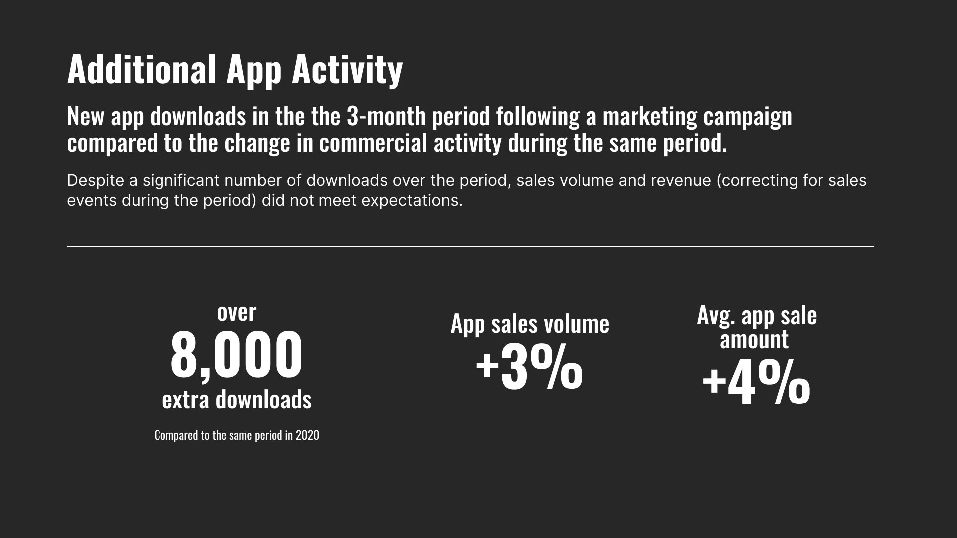
Shortly after the campaign ran I checked in with the marketing to see how it went and they were generally quite happy with the results. App store analytics showed a significant uptick in downloads so management seemed pleased. I queried about actual traffic/usage on the app but they didn't have those numbers and didn't seem to have any historical numbers either.
Marketing Efforts versus sales activity
Of course, it can be hard to distil a week-to-week comparison for retailers like Brown Thomas. Sales are highly seasonal and dependent on any number of factors. But even with that proviso these numbers just didn't add up to me.
Not to mention, I was left wondering what was the point in spending thousands of euros on marketing campaigns to get people to download an app they didn't seem to be using.
The Onboarding Journey
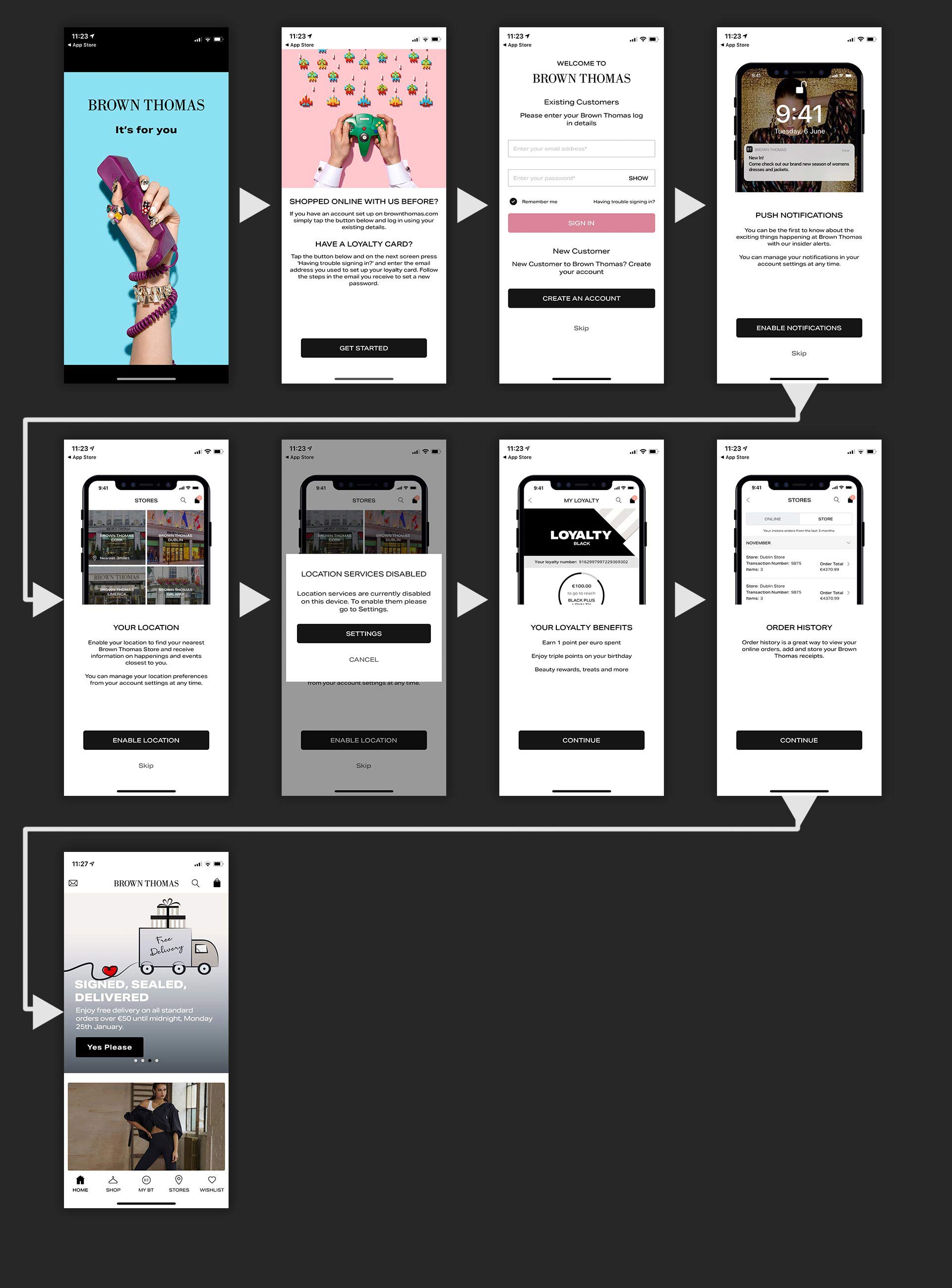
The onboarding journey for new BT users.
The Onboarding Journey
To my shock, before a user can even see any item in the BT app all new users are forced to go through eight different steps (ten on iOS if you count the native permissions dialog boxes).
I suspected that this laborious process was discouraging users from either creating an account or even from continuing to use the app. Click the button below to walk through the individual onboarding steps.
See Onboarding Journey In Detail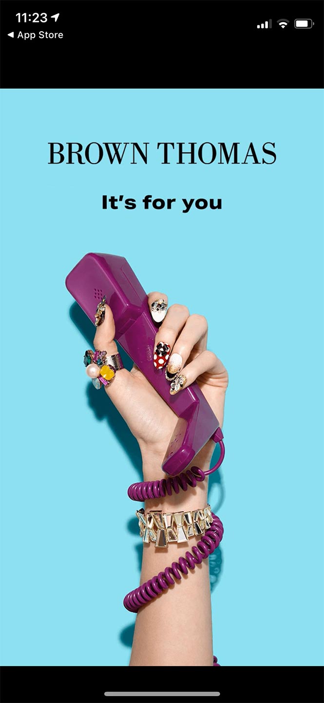
App loading screen
1/8
The journey starts with a branded splash screen while the app initialises.
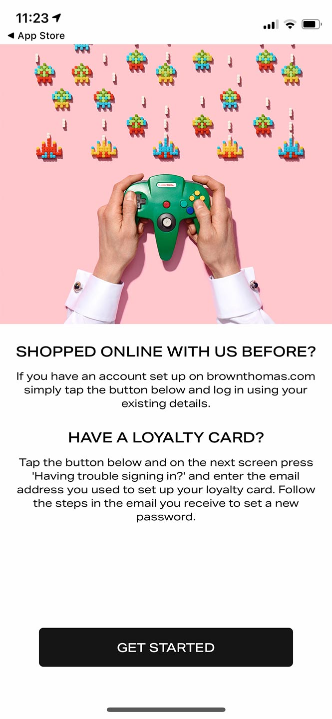
Introduction to the app and some functionality.
2/8
The next stage in the process is a bit confusing, however. There's some copy telling users that if they already have an account they can click the button on the bottom to continue and log in. Then there is more copy asking the user if they have a loyalty card already. Then the same instruction to click the button below to continue and sign up. Bear in mind also, that there is only one button and therefore possible action on this screen; click the button. So the questions and conditions are completely superfluous and even confusing to a new user. There's no context as to what the loyalty programme is. There's a mention of a web address, the url of the store implying they have to set up an account on the web. Something that can also be done in the app on the next screen.
Login or create new user options
3/8
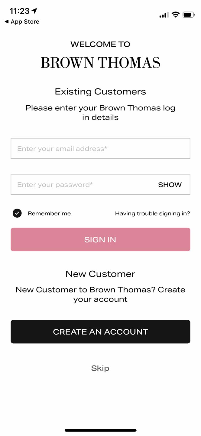
The next screen is a more typically expected login/register/skip this step screen. But it clearly renders the previous onboarding step redundant. From this stage existing users can either login, request a forgotten password or create an account. Choosing to create starts the registration journey about which I will go into more detail later. For now lets continue with the regular onboarding and assume we are an existing user.
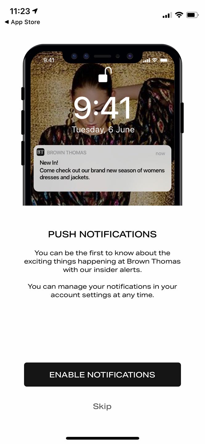
Option to enable push notifications. Note that no matter if users accepted or not an extra iOS dialog box appears after selection to confirm the user's choice.
4/8
Having now downloaded and logged into the app, the next step we are confronted with is a request to enable notifications or skip to the next step. Obviously, how amenable users are to push notifications will vary wildly across user segments and industries but in a world where nearly every website seems to have a cookie consent popup, people are a lot warier of accepting notifications. Especially when you consider users on average 40-50 push notifications per day. Its also important to note that due to a hard permissions gate on iOS any user opting into notifications has to click yes twice. Once on our Brown Thomas branded button and then again in a native iOS dialog box.
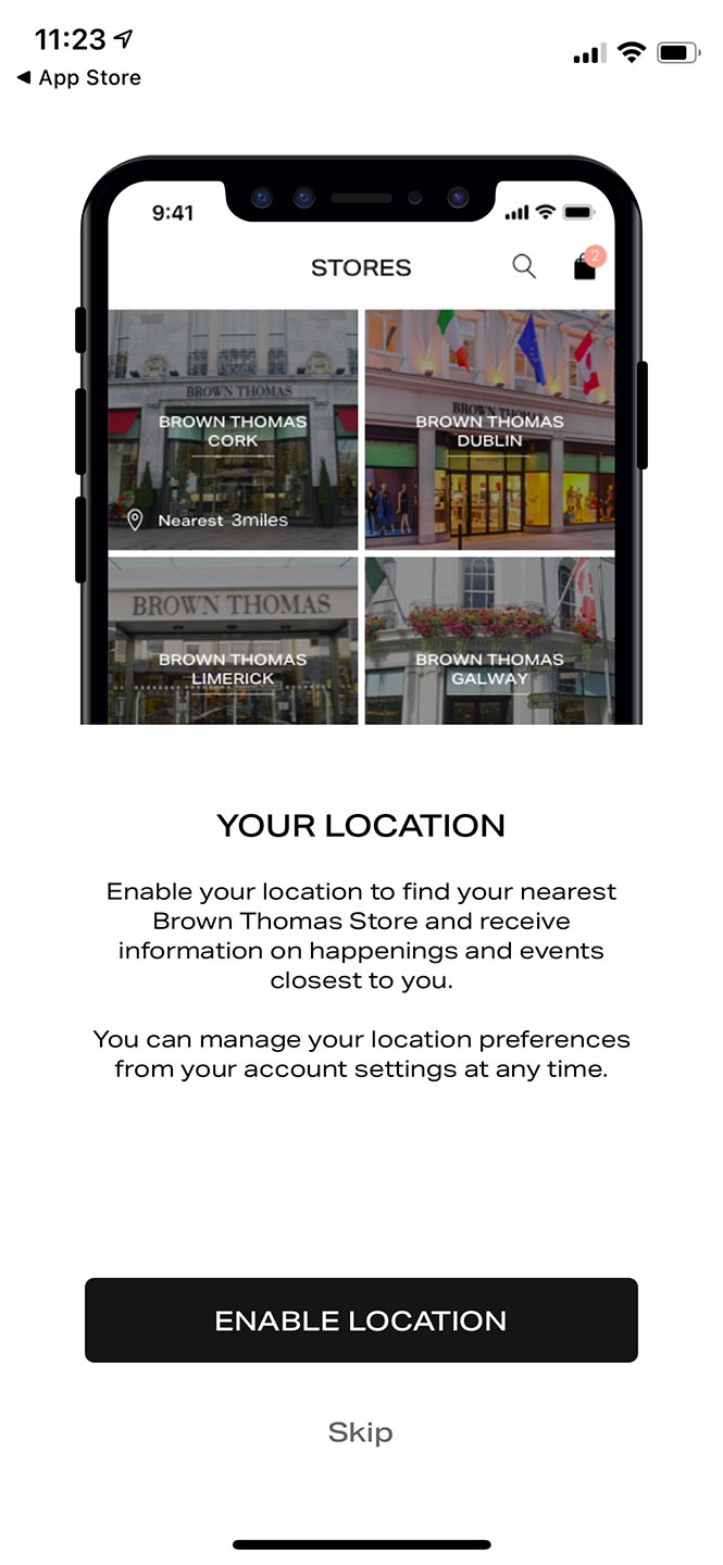
Option to share location data with Brown Thomas. Similarly, an iOS dialog box appears here too to confirm user choice.
5/8
Next the app asks that users share their location data with the app, or to again skip this step. The same point on notifications applies here also; users are more sensitive these days to sharing this kind of data with brands and retailers. There's also an additional problem with location services if the user has a default position of blocking or denying access to location data. As a result, another modal will pop up directing the user out of the app altogether to their phone's settings so they can enable location services. Even if the user has not blocked location services, a native iOS dialog will still appear to confirm here.
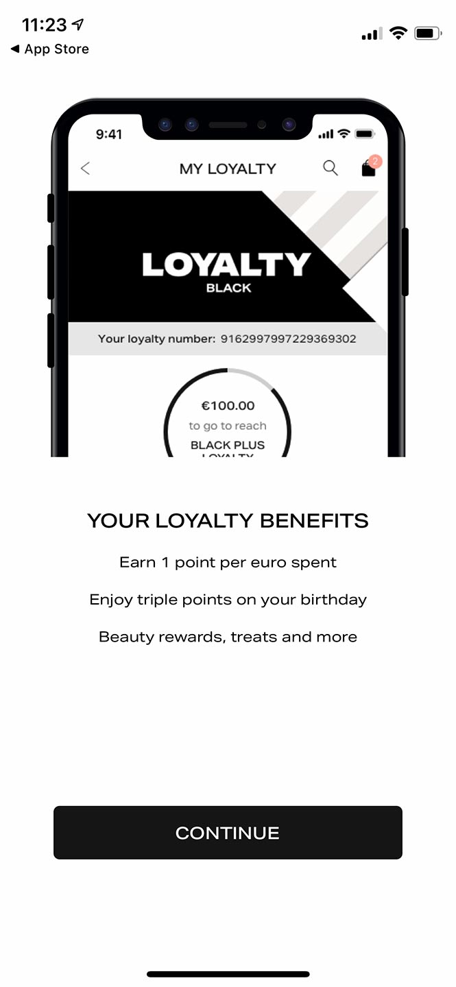
Copy describing some features and value of the Brown Thomas Loyalty programme.
6/8
You might expect at the point that a user will finally be able to shop, but you'd be disappointed because next we're shown an info screen extolling the benefits of the loyalty programme. There's no call to action to sign up though, just an image and a few lines about loyalty points and a continue button. Also note that this info page shows up whether the user has logged in or not, and also if they're already in the loyalty programme or not.
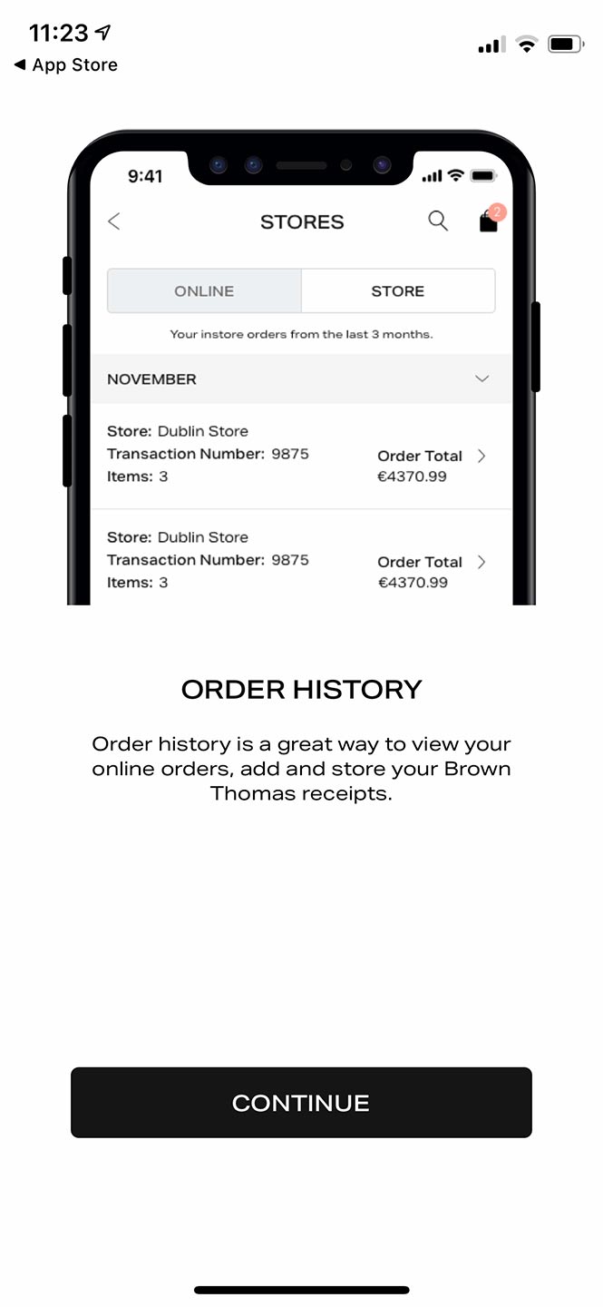
Describing the functionality of being able to see past orders in the app.
7/8
Our next onboarding step is another info screen telling the users that they can view their past orders and receipts in the app.
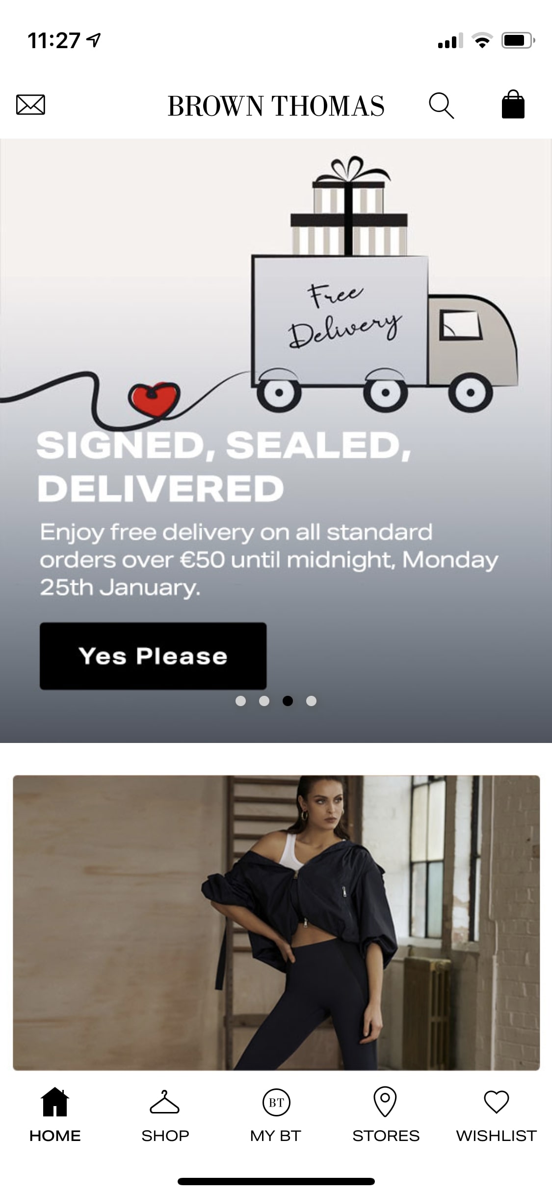
Home screen of the Brown Thomas app.
8/8
Finally, we're at the end of the onboarding process and presented with the home screen of the app. The homescreen constitutes a promotional panel that is usually changed every few days, some store information further down the page and a nav bar. If the user clicks shop they will finally be allowed to view and shop for products.
The Ask
Onboarding Roadblocks
It was clear that a more intuitive and forgiving onboarding experience would likely go a long way to improving activity on the app, so this was the priority while still balancing the secondary aims of the business; branding, loyalty sign-ups etc as well as conversions.
The appeal of the BT app is the ability to buy BT's products from your phone. It's a portal that allows users to buy whatever luxury item right in their pocket. And yet once we convince someone to download the app, we bombard them with login screens, permissions requests and brute force attempts at loyalty sign-ups and data collection.
I brought some of my concerns to a member of management that administered the app. Through our conversation got the sense that while neither of us had been in the company at the time, there had been a lot of competing and contradictory input from different departments at the time of the app's original development. And of course, each department was advocating for their own needs at the expense of the overall experience. CRM wanted emails, Marketing wanted to shout about the app's benefits, loyalty wanted more loyalty sign-ups etc. There had never been a UX advocate arguing for a holistic view of the app and its onboarding... until now of course.
Goals
This digging meant that I had succeeded in creating a bit of work for myself. In order to keep things on track I established a few goals.
- Increase the percentage of users who complete the onboarding process.
- Increase the percentage of users who grant the required permissions.
- Create a more user-friendly and intuitive onboarding experience.
Research
Tracking down the numbers
With my curiosity piqued I went to our analytics team and asked about the app numbers. However, I was shocked to find out that there was basically no analytics function available to us in the app. The entire app (the Arnotts app too) on both iOS and Android was a black box.
This was a huge issue because while it makes sense to draw a line between a sub-optimal onboarding function and depressed activity, without analytics it's difficult to prove. Not to mention, if we had comprehensive analytics we could track where most users are dropping off and where they're struggling the most. Shorn of a quantitative method I would have to rely on user testing and observation to identify the pain points.
The one solid metric we could measure was conversions. we could see purchases, sales volume and how much money was spent but little else. So I queried that data and was even more surprised to see that sales in the wake of the marketing campaign had barely moved.
So I took a little time and decided to take a look at the app experience. I removed the dev version of the app that we used for debugging feeds and assumed the role of a new BT app user.
Designing Solutions
Simplified Onboarding
As discussed I had identified a number of issues in the onboarding experience, so rather than continue to pick through the wreckage I began to sketch out some potential solutions. Some solutions were design-driven but others were more complex organisational and business-related. Our lack of analytics for instance was due to the nature of the contract with our third-party app supplier. It was never a requirement in the original negotiations, so our supplier was unmoved in our attempts to implement an analytics function.
Similarly, one of the issues that had become apparent was the conflicting priorities at play within the app experience. The onboarding sequence was a microcosm of the app in this way. Part of my job here was to begin to realign the priorities of the app with that of the wider business and put the user's experience front and centre.
With that aim in mind I set about killing two birds with one stone; streamlining the onboarding process and finding a new home for the elements I remove from onboarding. I didn't think we should demand users' location data or email address the moment we've gotten them in 'through the door' so to speak. But we still had to ask for them at some point.
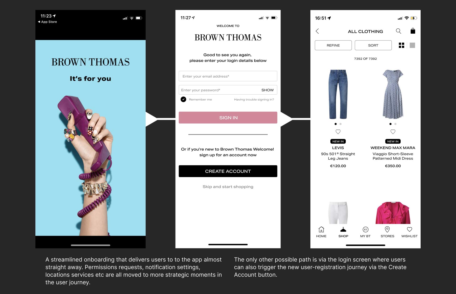
The new proposed simplified onboarding journey.
Collecting Marketing Permissions
It would've been easy to abandon all attempts to strip out the permissions requests screens but instead, I sought to fold them into the user's journey more seamlessly.
My solution was to identify and exploit moments when the user is highly engaged and the requested user data is more relevant to the interaction.
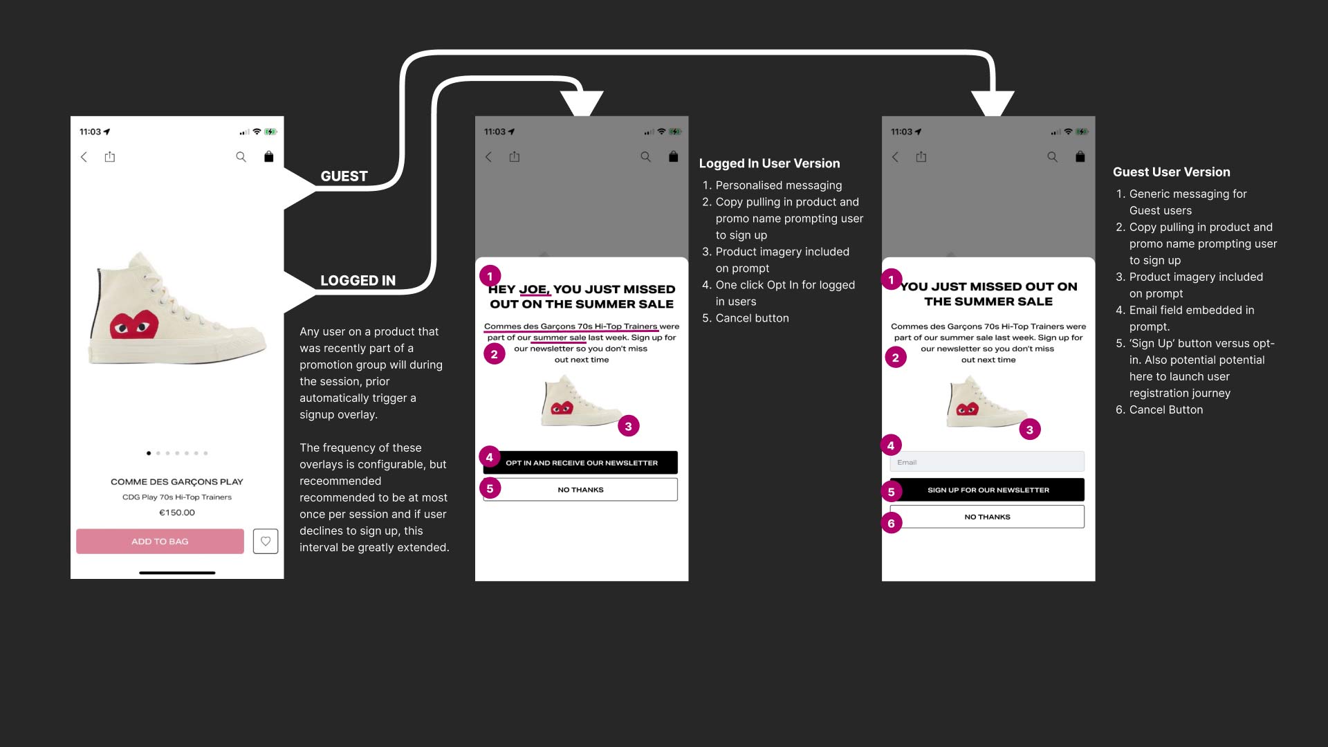
For instance, the below example prompting a user to sign up for the company's newsletter is triggered by the fact that they have landed on an item that is out of stock. We offered a stock replenishment email on beauty products to remind users to re-stock on consumable products after a set period of time.
This is a perfect example of meeting the user halfway and taking a negative customer experience (showing an out of stock product) in a more positive direction.
Similarly, we often have products that are subject to limited-time offers, like discounts, bundle deals etc. So I proposed that if we have a user land on a product that was recently under offer, we prompt them to sign up to our marketing database so they'll hear about the offer in advance next time.
s Growing subscriber lists doesn't have to annoy users and cannibalise the experience if we're more selective about how and when we ask. This same principle holds true for users sharing their location too as there would be times when in-store events are provided that are relevant and interesting to our clients - but only if they're in the area, of course.
Newsletter sign up prompt
Driving newsletter sign-ups and push notification permissions
I also proposed that we remove the newsletter sign up prompt from the onboarding journey and employ this same targeted approach.
The above example is triggered when either a guest or logged-in non-loyalty user adds an item to either their wishlist or their shopping bag.
We gently nudge them about the benefits of signing up and keeping an image of the product visible during the sign-up process. Thus providing the users with context of what led them to this moment and also reminding them what they can gain by signing up for our newsletter. The same logic applies when it comes to push notifications. Demonstrate the value of them to the user and give them a frictionless path to accept them.
This serves to re-balance the user's relationship with BT to be a value exchange instead of bluntly denying, or at least discouraging, the user's access to the app.
Essentially forcing us the business to demonstrate our value before demanding something more from the user than their attention.
Outcome
The proposals detailed above constitute a very broad rewrite of the primary path taken by users into the app and as such, I didn't expect them to be implemented straight away.
Sure enough, this proved to be the case.
The new design also received positive feedback from stakeholders, and though there was some trepidation that this more subtle targeted approach would result in fewer signups and permissions acceptance, they did see the underlying intention behind my efforts and also found the onboarding process to be more user-friendly and intuitive.
This was a huge part of my effort to reorient the app towards being primarily for shopping. It was a philosophy change that we needed to make internally. in practical terms we unfortunately hit some roadblocks.
The Brown Thomas App
The nature of our contract with our app provider didn't come with scope for redevelopment or redesign. So while much of my designs were ready to be acted upon and write tickets for there simply wasn't the resources in place to deliver.
But, all was not lost.
I presented this new journey update as a proof of concept in an attempt to secure funding for a redevelopment and re-platforming of the app. Thankfully, senior management agreed with us and capital expenditure with a dedicated team and new tender for a supplier were approved for 2023.
I wish I could say that my work was what clinched the deal, but there were many moving parts in this effort. One thing is for sure that this journey redesign was an incremental step in a) improving the user's experience of Brown Thomas and b) moving the company's appreciation for UX in the right direction. It was a clear demonstration of the real business problems a clear-eyed UX approach can solve.
As such, while not yet complete, I look forward to seeing the new app being developed in the coming year.

ABOUT ME
I'm born and raised in Ireland where I worked for over twelve years in a number of design positions for both small teams and larger corporate entities and am looking for my next exciting opportunity in Berlin.
If you like the look of some of the above work, and would like to know more about these projects and the many, many others I've worked on over the years, drop me a line!
Contact
daryloleary@me.com